

SAN MATEO UNION HIGH SCHOOL DISTRICT
San Mateo Union High School District supports a diverse population in a very large region of the San Francisco Peninsula. Young and aspiring families seek to place their children in this district.

PROBLEM
The new Superintendent, RANDALL BOOKER, is looking for a way to improve the enrollment process for his district. He notices that the current process is too cumbersome leading to the parents having to come physically to the office to enroll. This puts unnecessary pressure on office staff.
SOLUTION
Improve the accessibility and simplify the process for student enrollment
TOOLS
Figma
Google Workplace
Trello
Design Thinking Process
Empathize
Define
Ideate
Prototype
Test
CURRENT SITE

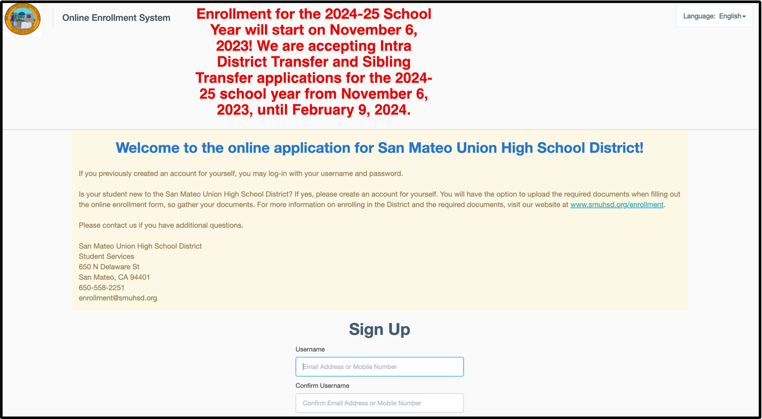
The Super Intendant said…
“Our SMDHS site was designed to keep parents in the district informed and make it easy for them to enroll their children.
We observed that our site isn’t meeting these goals. This causes more foot traffic in our physical office and burdens our staff.”
How might we simplify the enrollment process and enhancing site accessibility for Spanish-speaking, prospective, and young parents in the district, resulting in a more straightforward and gratifying enrollment experience.
SURVEY

63% of testers felt as though there was no clear way to enroll a child in any high school program

80% of testers felt at though the site would greatly benefit from a cleaner, clearer design

63% of testers felt that there was a clear way to translate but many also felt that the translations were not accurate.
Competitive Analysis

Piedmont Unified School Disctrict

San Ramon Valley Unified School District

Acalanes Union High School District
Similarities
Parents Tab & Events Section
The San Ramon site lacked a clear enrollment process
Differences
Piedmont site design was asthetically minimal
Piedmont is a much smaller district. 2,500 students as opposed to 10,000 students at San Mateo
Piedmont is a highly affluent community
For our competitors the overall flow of the site is apparent
Learnings
Better to have a simple and clean site.
Not too busy with concise information.
Does not overwhelm user
Simplified navigation. Primary and secondary navigation should be intuitive and labeled allowing users to find information efficiently
Opportunities
Users should perceive an easy step by step enrollment flow on the District Site
There should be a clear and visible path to enroll from the homepage.
Reduce foot traffic into the district office
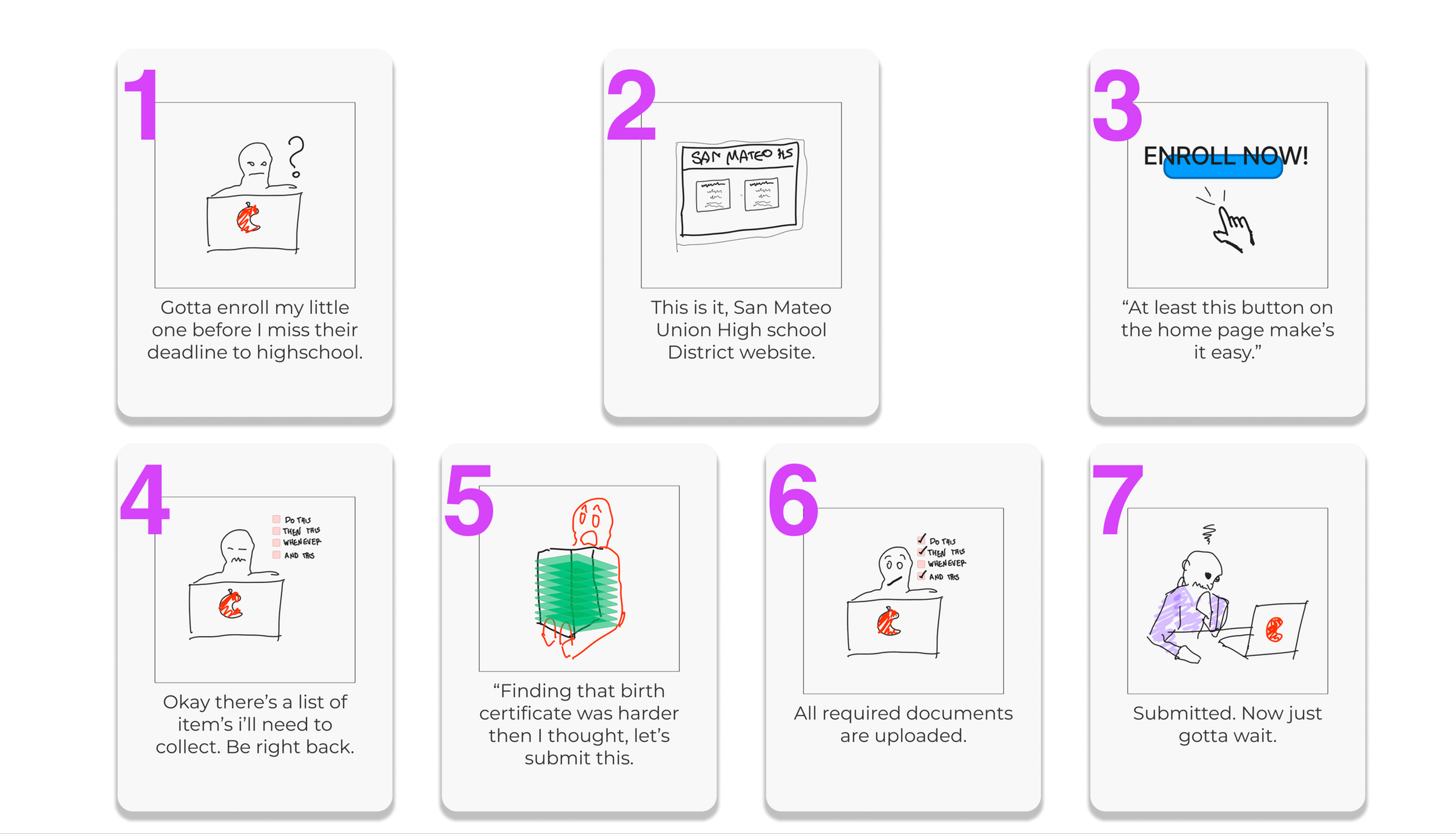
STORY BOARD

JOURNEY MAP
USERFLOW

Prototype (LoFi)


Prototype & Style Guide UI


WHAT WE LEARNED
We increased the usability of the design by rearranging the buttons Increased spacing on the page.
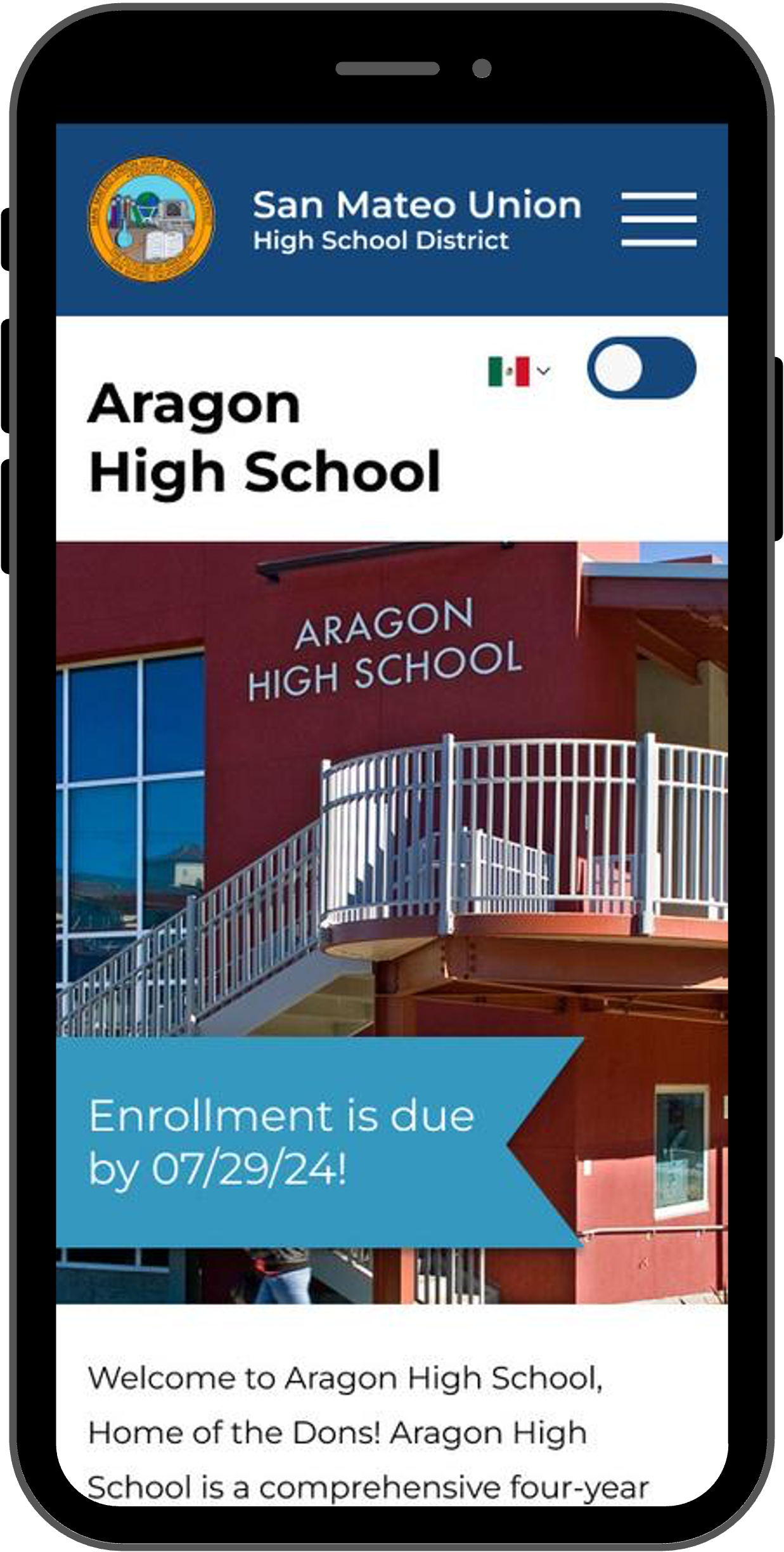
Users wanted to to click pictures. To decrease the confusion on enrollment page we removed pictures for the schools
Users tended to be unsure that the enrollment process ended. We added a completion modal.

